ABOUT
Objective: Create a package design system for “The Ordinary” that breathes new life into their brand, engages the target audience, and sets their products apart from the competition.
Approach: Define the brand parameters to develop a cohesive packaging strategy that adds personality and allows consumers to better interact with the brand.
-
Package Design
-
The Ordinary is an evolving collection of affordable treatments offering familiar, effective clinical technologies positioned to raise integrity in skincare.
-
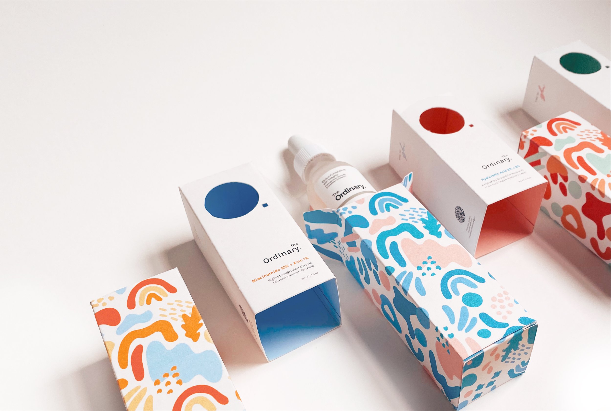
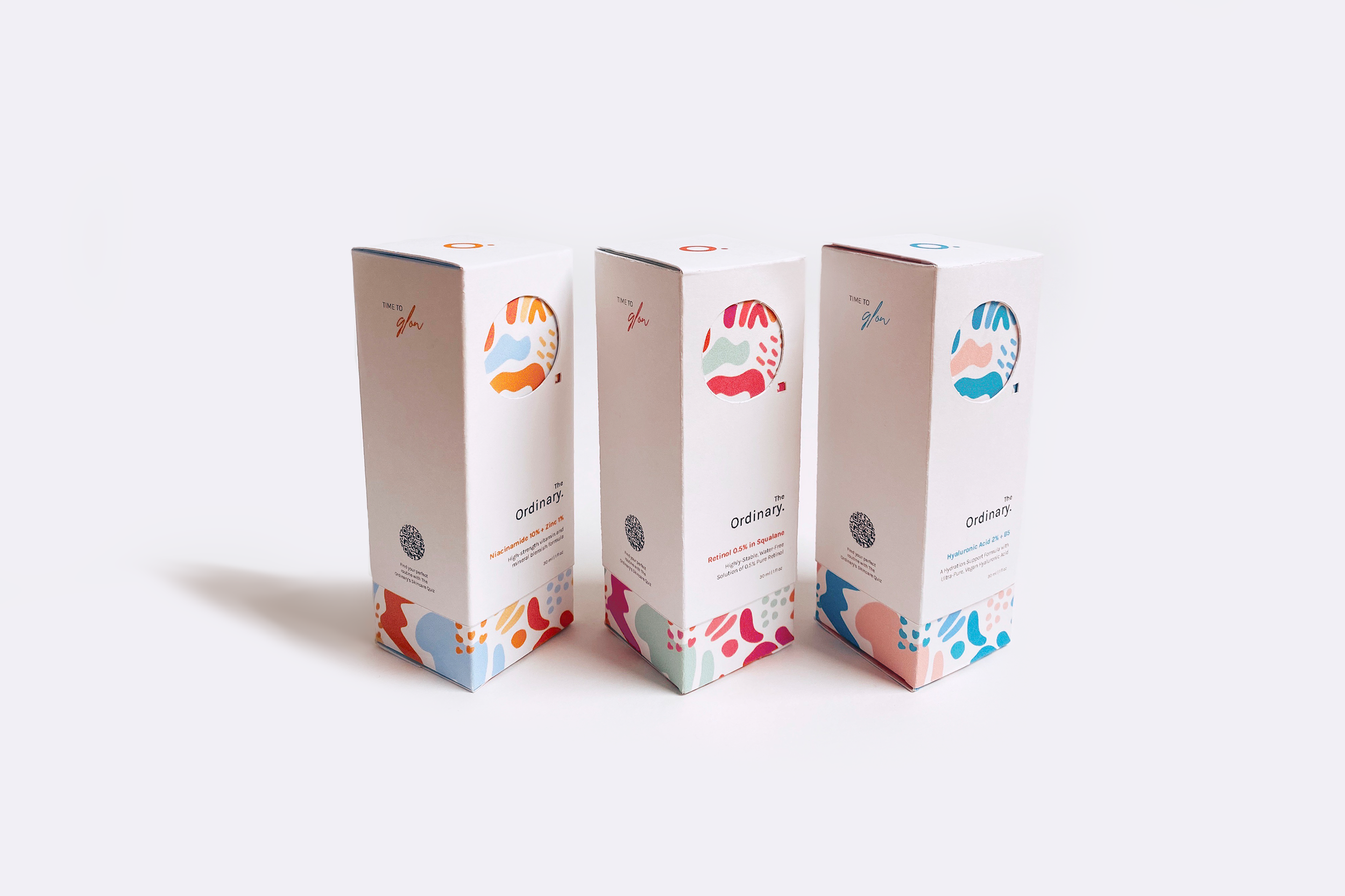
This project contains a packaging system with QR code access to a skincare quiz in order for consumers find a personalized regimen for their skin’s needs.
-
Illustrator, Photoshop, Procreate


COLOR
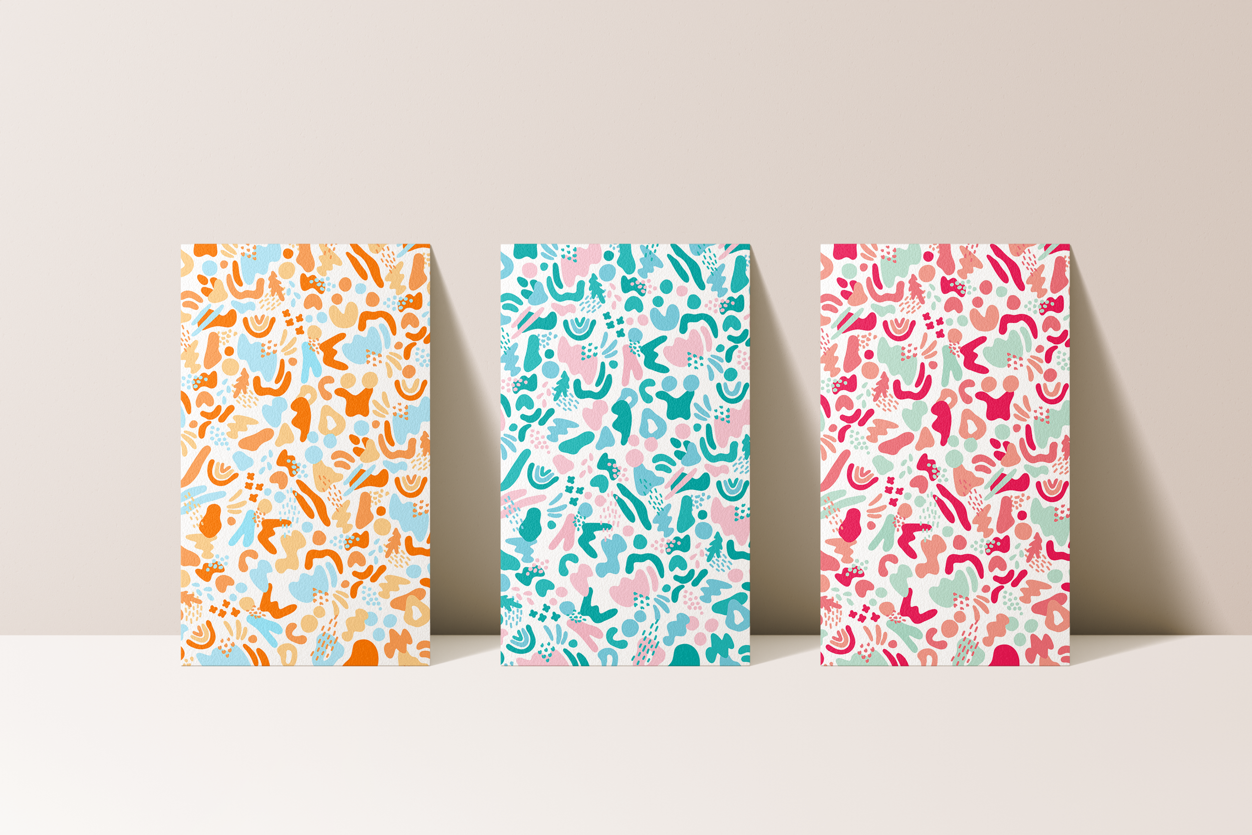
I needed a color scheme that would capture the target audience’s attention but not overpower the design. With the overall use of blues, oranges, and pinks, I was able to create three distinct yet cohesive color schemes - each dedicated to the specific product inside.
PATTERN
Using Procreate, I illustrated a playful pattern composed of organic shapes in order to add personality to the package design and give the colors a designated place to live. This pattern is subtly revealed as the consumers slides the cover off of the box.
TYPEFACE
In order to reflect the brand’s value of simplicity, I chose the very minimal sans serif typeface, “Karla.” Even when scaled down in size, this typeface is easy to read and clearly shows the authentic ingredients in the products.


PROCESS.
Click below for a behind-the-scenes look at the research, ideation, and execution phases of this project.
